
RiverTrail Beerworks
BRANDING • LOGO DESIGN • ILLUSTRATION • VISUAL IDENTITY
The newest brewery in the Adirondacks needed a visual identity that would tie into the history of Saranac Lake while presenting a fun attitude and professional feel. These people are experts on having a good time.
RiverTrail Beerworks is the latest brewery developed by the Chris and Catherine Ericson. They started in Lake Placid with the legendary Lake Placid Pub & Brewery and then opened the successful Big Slide Brewery & Public House. Now they are opening a new brewery and restaurant in Saranac Lake, New York.
When the Ericsons first reached out about branding for their new endeavor, I was very excited. More exciting was an opportunity to work with Emilee Hazelden, a designer that I have been mentoring for some time now.
The Ericson’s outlined their vision for the new brewery. It was going to be set on the Saranac River in an existing industrial building. The loading dock and truck lot was going to be turned into a massive outdoor seating area with a view of the river. It would have a dock for paddlers to dock at. The inside would be part brewery, canning operation, and restaurant with indoor sports games like virtual golf. The village’s public River Walk would be routed right behind the open dining area.
Their competition are Saranac Lake local mainstays. Bars and restaurants that have been a part of the fabric of the community for years. So it was important that the new restaurant felt like it was part of the town from the get-go. The Ericson’s wanted to create a place that was purposefully designed, approachable, elegant yet comfortable, and relaxing. They wanted to create a place that would make customers say, “I can’t wait to go back.”
With a grasp of what the new venture was to become, Emilee and started doing our research. Saranac Lake is located in the Adirondack Park in northern New York (about a 5 hour drive from NYC). It has a long history that goes back to the days of Henry Trudeau who used Saranac Lake as a place to work on treatments for Tuberculosis. The Adirondacks themselves have a long history of conservation and outdoor tourism. The hearty Adirondack Guide is a fixture in the lore of the mountains. Steams, ponds, and lakes cover the countryside. It is a beautiful and rich visual tapestry to pull from. It was important to the Ericsons that the new brewery be reflective of the spirit and history of its home town.
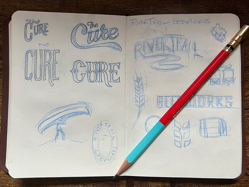
The first task was to figure out what to call the thing. We produced a list of about 20 names and whittled that down to 10 and brought that to the Ericsons. They were wonderfully collaborative to work with. We worked with them and settled on the name RiverTrail Beerworks. Now the fun begins!
Emilee and I worked to create options for the Ericsons to choose from. We pulled visual references from the natural world, from the history of Saranac Lake, and brewing technology.

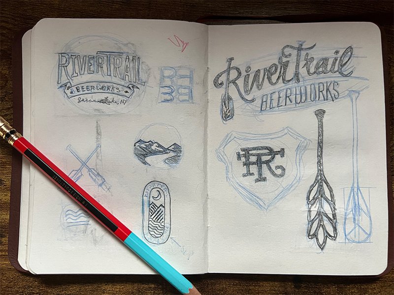
The design that was chosen checked a number of boxes. First, the main typography harkens back to the gilded age, the height of Great Camp Architecture, and the commerce at the time. We wanted something that would be at home on wooded crate as well as on a t-shirt. A font called Gin was used to create a bold appearance that looked like it belonged to a well established institution. We paired that with a clean and simple san serif called Brandon Grotesque. This comes in many weights and works well as both a header and a copy typeface.
It was important to the Ericsons that the brand highlight the location. So we created a tag under the logo that reads “Saranac Lake, N.Y.” so there can be no doubt where you are.

For the mark, we combined the imagery of a hop and wheat with a canoe paddle. We wanted the mark to be instantly recognizable, classy, but also fun and playful.
The color palette needed to be bold and fun, but also blend well with the Ericsons’ two other breweries in nearby Lake Placid. They wanted the RiverTrail brand to be unique, but not feel alienated from the other brands. We chose a crisp red as the primary color and paired it with a range of warm grays and black to provide contrast.
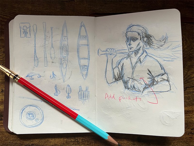
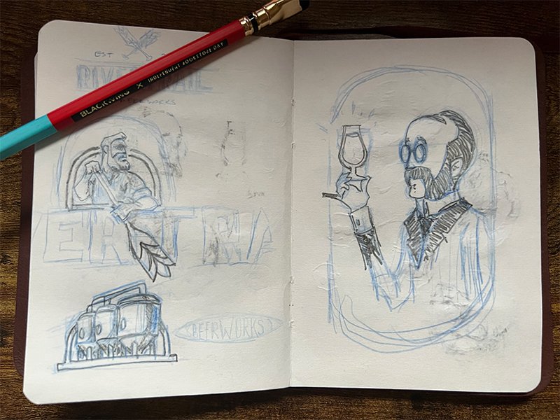
In building out the visual brand, we knew that the Ericsons would need a lot of branded collateral. Not just for signs, social media, and business cards, but for merchandise, beer cans, draft handles, basket liners, coasters, etc. We created several alternate versions of the brand that could be implemented across a variety of mediums. This included icons, badges, and patterns.

Overall, this has been one of my favorite projects to date. The Ericsons were great to work with, and it was fun working with a designer like Emilee. We are eagerly looking forward for construction to begin.
UPDATE: RiverTrail Beerworks is now open and it’s AMAZING.
